Material design is a comprehensive guide for visual, motion, and interaction design across platforms and devices. It was introduced in Android Lollipop version. In Material Design lot of new things were introduced like Material Theme, new widgets for complex views, custom shadows, vector drawables and custom animations.
Before diving deep into it lets discuss what is Material Environment.
The material environment is a 3D space, which means all objects have x, y, and z dimensions. The z-axis is perpendicularly aligned to the plane of the display, with the positive z-axis extending towards the viewer. Every sheet of material occupies a single position along the z-axis and has a standard 1dp thickness.

Figure 1 : 3D space with x, y, and z axes
For more information about it go through the below links which give you much knowledge over Material Design.
⇒ Material Design Specifications
⇒ Creating Apps with Material Design
So folks lets get start, in this tutorial we are going to learn step by step how to setup material design in Android Studio so lets open Android Studio and go from the start. If you are trying the Android Studio for the first time, go the overview doc to get complete overview of android studio.
1. Basic Understanding & Material Design Attributes
Before going further lets understand some attributes we are going to use in this tutorial that will help us to customize the Material Design Color theme.
colorPrimary – This is the primary color of the app. This color will be applied as toolbar background.
colorPrimaryDark – To set a custom color for the status bar, use the android:statusBarColor attribute when you extend the material theme. By default, android:statusBarColor inherits the value of android:colorPrimaryDark.
android:colorAccent – This will set the colors of UI controls like checkboxes, text fields and floating action buttons etc.
textColorPrimary – This is the primary color of text. This applies to toolbar title.
windowBackground – This is the default background color of the app.
navigationBarColor – This color defines the background color of footer navigation bar.
 Figure 2 : Customizing the material theme
2. Creating Android Studio Project
In Android Studio, go to File ⇒ New Project and fill the application name as “MaterialDesign“, package name as “com.nthreads.materialdesign” and proceed further to create a project. When it prompts to select a default activity, select Blank Activity and proceed. Don’t select navigation drawer activity because this will give you a whole lot of shit in the code and you will then sit down to edit it. So lets start with Blank Activity. After finishing these steps Android Studio will start building gradle, lets hope build gradle created successfully.
There you go… project is successfully created, at this point there is nothing in app so first step we gotta do is to support material design on devices that are newer or above lollipop as well as on older devices that are pre-lollipop .
1. Goto to File ⇒ Project Structure ⇒ App ⇒ Library Dependency ⇒ add appcompat-v7 support library. If you are on the latest version of Android Studio you don’t have to add it because its added already.
2. Now open build.gradle file and see new line addition in dependency section.
dependencies {
    compile fileTree(dir: 'libs', include: ['*.jar'])
    compile 'com.android.support:appcompat-v7:22.2.1'
}
3. Open res ⇒ values ⇒ colors.xml and add the below color values. If you don’t find colors.xml, create a new resource file with that name.
<color name="colorPrimary">#4ec07e</color>
<color name="colorPrimaryDark">#3b925f</color>
<color name="colorAccent">#4a90e2</color>

<color name="textColorPrimary">#FFFFFF</color>
<color name="windowBackground">#FFFFFF</color>
<color name="navigationBarColor">#000000</color>
4. Open styles.xml under res ⇒ values and add below styles with Theme.AppCompat.NoActionBar as parent.
<resources>
    <style name="AppTheme.Base" parent="Theme.AppCompat.NoActionBar">
    <!-- customize the color palette -->
    <item name="colorPrimary">@color/colorPrimary</item>
    <item name="colorPrimaryDark">@color/colorPrimaryDark</item>
    <item name="colorAccent">@color/colorAccent</item>
    </style>

    <style name="AppTheme" parent="AppTheme.Base">
    </style>
</resources>
So here a question may arise in your head that why we are using NoActionBar, it is because ActionBar is depricated by something known as the ToolBar and we are going to use ToolBar in our app.
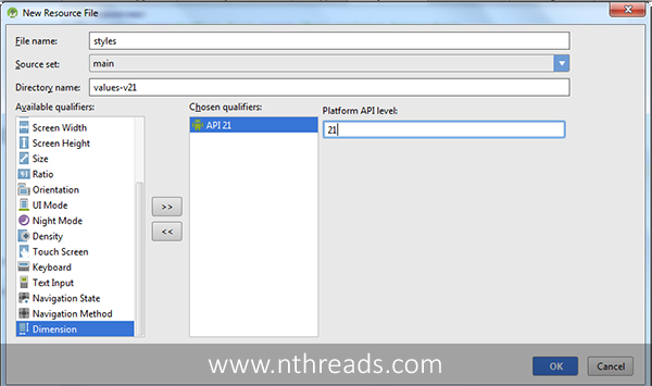
5. Now right click on values goto New ⇒ Values resource file enter file name styles, select version qualifier and enter 21. 
This will create a new styles.xml file inside values-v21, add below style in this file. These styles are specific to Android Lollipop only.
<?xml version="1.0" encoding="utf-8"?>
<resources>
    <style name="AppTheme" parent="AppTheme.Base">
        <!-- customize the color palette -->
        <item name="android:colorPrimary">@color/colorPrimary</item>
        <item name="android:colorPrimaryDark">@color/colorPrimaryDark</item>
        <item name="android:colorAccent">@color/colorAccent</item>
    </style>
</resources>
Now if you run the app, you can see the notification bar color changed to the color that we have mentioned in our styles.

So in this tutorial I’ve showed you how to setup basic material design in android studio, in the next tutorial we will learn how to Customize Material Design and Toolbar.
